In my recent posts, You've seen how to Make the Website Mobile, Tablet, Desktop Compatible and Test Responsive Web Design. In this post, you'll see different ways to design responsive navigation menu.
1. Simple Menu:
It's simple CSS menu based on "one design for all". Menu links goes to next line if browser window is narrow. Generally It's independent of media queries conditions.
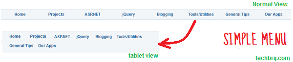
In this approach, when any link goes to next line, the empty space after the link become useless and it looks not so good.
2. Menu Links with alignment:
In this approach, navigation links are divided into equal parts to cover whole browser width and it reduces with browser width for a limit and after this whole menu divided into two rows with equal width and so on.

3. Menu Links With Button:
In this approach, one button is displayed for small devices and on clicking or mouse-over button, navigation menu will be displayed as drop-down.
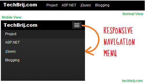
It's useful when you want to focus on content.
4. Menu To Dropdown:
In this approach, When the browser window is narrow, the menu converts from a regular row of links into a dropdown control elements. I like this approach the most. Right now, It's done in SmashingMagazine.
In apporach 3, the menu links are displayed using javascript and you have controls on link means you can display multiple links in single row, but in approach 4, links are displayed as dropdown control items and device browser will have control to display.
Share your opinion and suggestion about responsive navigation menu and let us know how you are implementing it.