I am working to redesign TechBrij theme and taking idea from different sites. Here are some points which I learned from Facebook design.
1. No Need of Full logo on each page:
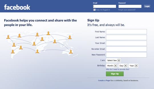
Generally, The same logo in used for each page. It takes enough space. In Facebook, Full logo is displayed only on home page if you are not logged in. A small logo is used in left side. It saves space on the page.

2. Notification Icons in Menu Bar:
In Facebook, Left side bar is not common. If we are on another page and have to see notification, we need NOT to go at home page, select option from left side bar. Notification items are available in menu bar. One more thing, If there are multiple notifications, after visiting once, all are disappeared. It is not irritating again & again.
3. Search Box in Menu Bar:
There are many sites use search-box in menu bar, but it is placed either left or right side. Facebook uses search box in center(not exactly) of Menu bar.
4. Left Side Photo:
The photos will affect people's perceptions of you - especially because they are most likely to see you first in that format. Reader will see page left to right (And top to bottom). So photo is the most important thing in the page on great place.
5. Login and Sign Up on Home Page:
In most sites, there are separate pages for login and sign up. In some sites, there are links on home page, user has to click on the link to login or sign up. Facebook has both things on same home page. It saves user time.
Final Thought:
Facebook uses the space effectively in the webpage and placement is good. Facebook header has logo, notification items, search and options while other sites has same thing taking more than 3 times space. Facebook has web friendly colour combination (Blue-white).
Hope you enjoyed it, Share your thought about it in below comment box!!!