This article explains how to perform different types of data visualizations in Python using Matplotlib - a Python 2D plotting library. Instead of covering features of the library, we will see the practical scenarios of data visualizations used in machine learning/deep learning. We will import pyplot function that allows us to interface with a MATLAB-like plotting environment.
To install Matplotlib, run following command in Python environment:
pip install matplotlib
I am using Python 3.7.6, Matplotlib 3.1.2 and Windows 10 environment for this article.
Arrays
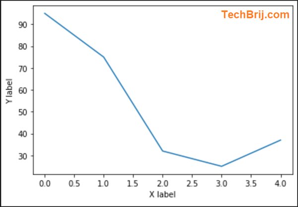
Generally, the response of ML model is in array format (like in simple deep learning model, you might get array of loss (error in each epoch) as mean square error).
Let's see how Array can be visualized:
import matplotlib.pyplot as plt

arr_data = [95,75,32,25,37]
plt.xlabel('X label')
plt.ylabel('Y label')
plt.plot(arr_data)
plt.show()
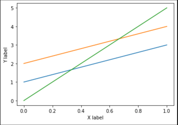
Let's see respone in case of 2D array:
import matplotlib.pyplot as plt

arr_2d_data = [[1,2,0],[3,4,5]]
plt.xlabel('X label')
plt.ylabel('Y label')
plt.plot(arr_2d_data)
plt.show()
You can see three lines are displayed with 2 points in each line. First child array is displayed on x=0.
It is equivalent to following code:
import matplotlib.pyplot as plt

plt.xlabel('X label')
plt.ylabel('Y label')
plt.plot([1,3])
plt.plot([2,4])
plt.plot([0,5])
plt.show()
To add legend and titles for each line:
import matplotlib.pyplot as plt

plt.xlabel('X label')
plt.ylabel('Y label')
plt.plot([1,3], label='Line 1')
plt.plot([2,4], label='Line 2')
plt.plot([0,5], label='Line 3')
plt.title('Main Title')
plt.legend()
plt.show()
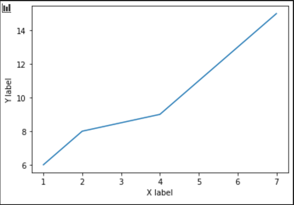
Let's define separate X and Y values:
import matplotlib.pyplot as plt

x_data = [1,2,4,5,7]
y_data = [6,8,9,11,15]
plt.xlabel('X label')
plt.ylabel('Y label')
plt.plot(x_data, y_data)
plt.show()
Plot Types
We can create multiple plots use subplot method which takes nrow and ncols parameters.
ax1 = plt.subplot(nrows=2, ncols=2, index=1)
equivalent, but more general shorthand
ax1 = plt.subplot(221)
Let's draw different charts in different subplots
import matplotlib.pyplot as plt
x_data = [1,2,4,5,7]
y_data = [6,8,9,11,15]

#Sub-plots
ax1 = plt.subplot(221)
ax2 = plt.subplot(222)
ax3 = plt.subplot(223)
ax4 = plt.subplot(224)

# to plot the bar
ax1.bar(x_data, y_data)
ax1.set_title('Bar plot')

# to plot scatter
ax2.scatter(x_data, y_data)
ax2.set_title('Scatter plot')

# to plot histogram
ax3.hist(y_data)
ax3.set_title('Histogram')

# to plot pie chart
ax4.pie([37,22,41],labels=['A','B','C'],autopct = '%1.1f%%' )
ax4.set_title('Pie Chart')

plt.tight_layout()
plt.show()
tight_layout() will also adjust spacing between subplots to minimize the overlaps.
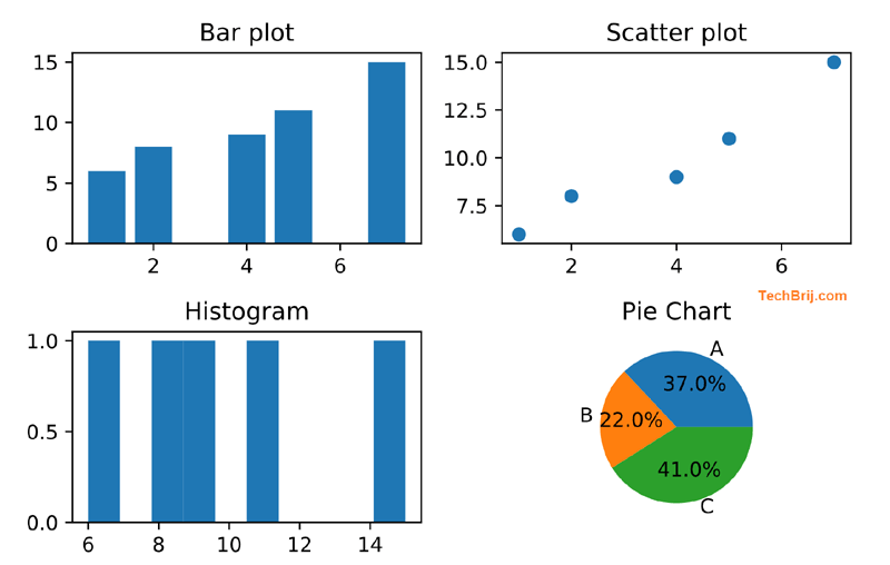
The above explains different type of graphs you can choose based on your data analysis requirements
Images
In case of Image classification in Machine Learning, you might want to display image with prediction information. Let's see how we can display images using Matplotlib.
We will use PIL module. to install run following command in python environment:
pip install Pillow
To display image:
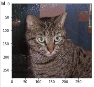
from PIL import Image
import matplotlib.pyplot as plt

# reading png image  file
img = Image.open('C:\\datasets\\cats\\cat.1.jpg')
imgplot = plt.imshow(img)
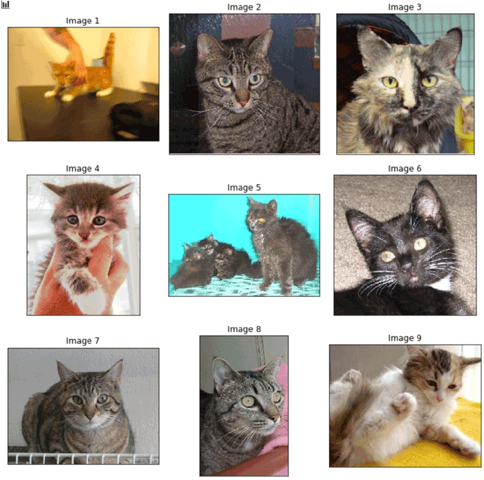
Generally, we used to deal with image array in machine learning. Let's read images from a path to generate image array and display it in plot
import glob
from PIL import Image
import matplotlib.pyplot as plt

# To read images from a directory
images = []
for img_path in glob.glob('C:\\datasets\\cats\\*.jpg'):
    if len(images)>=10:
        break
    img = Image.open(img_path)
    images.append(img)

# Draw the chart
fig, axes = plt.subplots(3, 3,  figsize=(10,10))
axes = axes.flatten()
for i,(img, ax) in enumerate(zip(images, axes)):
    ax.imshow(img)
    ax.set_title('Image {}'.format(i+1))
    # Hide axes ticks
    ax.set_xticks([])
    ax.set_yticks([])

plt.tight_layout()
plt.show()
We picked 9 images from the path and get them displayed in 3x3 grid.
Output:
Conclusion
Matplotlib is standard Python library for data visualization and plotting. In this article, the most frequently used Matplotlib functions especially for machine learning/deep learning are explained.It covers from installation, displaying Arrays, Subplotting, different plot types and to display images.
Feel free to share your thoughts in comment section.
Enjoy Python!