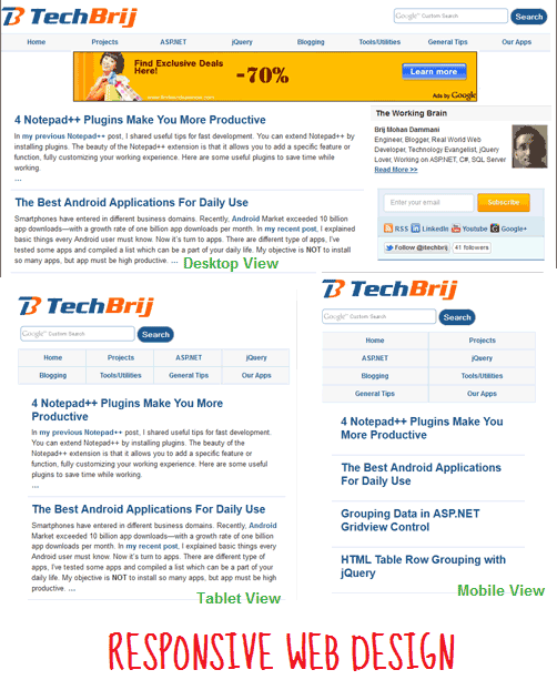
Every client wants their website compatible with all platforms, whether user is accessing the site on a mobile phone, tablet, desktop computer or wide-screen. There are so many devices BlackBerry, iPhone, iPad, netbook, kindle..etc with different sizes and resolutions. It's impossible to create a website version for each resolution. With Responsive Web Design technique, the website adapts the layout to the environment that it is being viewed in. It makes similar feelings for all platforms. You can see TechBrij as an example by resizing the browser window if you are on a desktop.
Steps:
1. In your basic theme for desktop browsers, See each element of web page and think for tablet and mobile view. You can use notebook pen for complex layout.
2. Change element dimension from pixel value to percentage value and make some additional changes to make it similar on same environment.
3. Use Meta tag to disable default mobile scaling to display web page fit on screen.
<meta name="viewport" content="width=device-width, initial-scale=1.0">
4. We're going to use CSS3 Media queries, but Internet Explorer 8 or older doesn't support it. So use media-queries.js to add media query support in IE.
<!--[if lt IE 9]>
	<script src="http://css3-mediaqueries-js.googlecode.com/svn/trunk/css3-mediaqueries.js"></script>
<![endif]-->
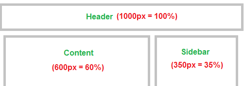
5. Use CSS Media queries to define special CSS rules for different viewport width ranges/resolutions.
@media screen and (min-width : 750px) {
#content{float:left;width:60%;}
#sidebar{float:right;width:35%}
}

@media screen and (min-width : 481px) and (max-width : 749px) {
#content{width:95%;}
#sidebar{width:95%;}
}
You can create separate CSS files for different Media queries.
<link rel="stylesheet" type="text/css" media="only screen and (max-device-width: 480px)" href="small-device.css" />
6. Make images, iframe width flexible.
img {
	max-width: 100%;
}
iframe, object, embed{
width: 100%;
}
7. Test it.
These are the basic steps to implement responsive web design. Alternatively, CSS Frameworks like Less Framework 4, MQFramework, Foundation, Skeleton..etc are used for rapid development.
Resoures:
Media Queries for Standard Devices
Responsive Design with CSS3 Media Queries
Responsive Web Design, most complete guide
Responsive Web design creates a great custom experience for everyone. Share your opinion and about how you're implementing responsive design.